People are known to make quick decisions on websites. They may not study every section or read every word, but they notice when something feels unclear. A vague headline can make the business seem hard to understand, and a broken form can make someone wonder what else has been neglected.
Trust usually starts before someone contacts the business. It starts when the visitor can understand who they are dealing with, what the company does, and whether the website feels current enough to rely on.
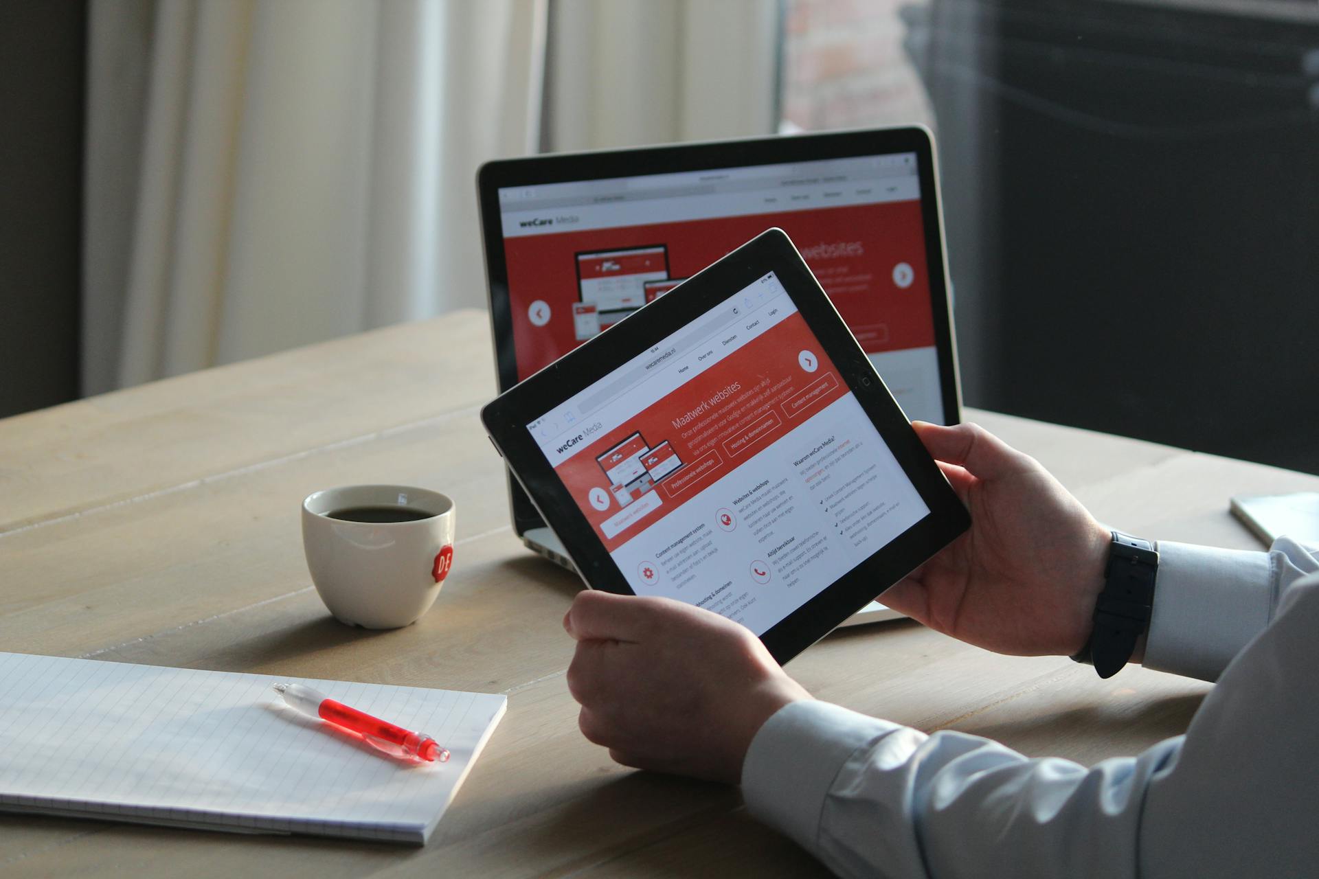
For most businesses, trust comes from clear information, honest proof, and a page that helps people take the next step. We'll go over a few steps today on how your business can feel more trustworthy for visitors.
Make the Business Easy to Verify
One of the simplest ways to build trust is to make the business easy to verify. If a visitor has to search for a phone number or fill out a form without knowing who will receive it, the site is asking for trust before it has earned any.
For a local business, you can make the contact page do more than provide basic details. It can confirm the service area, show that the company is active, and reassure visitors that someone real is on the other side. Even small details help. A plumbing company that lists emergency availability feels different from one that only has a generic 'Contact Us' button. A web agency that explains how project inquiries are handled feels more approachable than one with a blank form and no context.
The Stanford Web Credibility Guidelines include easy-to-find contact information as one of the ways websites can improve credibility. It is straightforward advice, but it still gets missed on many business websites.
If a business does not publish a street address, the site can still give visitors confidence. A clear service area, support process, or even a response expectation can help people understand how the business operates.
Say What the Business Does
A lot of websites sound polished without being very helpful. They describe the business as experienced, reliable, innovative, or customer-focused, but the visitor still has to figure out what is actually being offered.
Specific copy is usually stronger. A service page should help the right visitor recognize their problem on the page. For example, 'custom web solutions' is broad. It could mean almost anything. A more useful page would explain whether the team builds WordPress websites, ecommerce stores, booking systems, membership portals, integrations, or custom web applications.
The same idea applies outside of web design. A contractor should explain the kinds of projects they take on. A clinic should make it clear which services are available and what a new patient should expect. A consultant should explain the situations where they are the right fit, instead of relying on general language about strategy and growth.
Clear copy saves the visitor effort. It also saves the business time, because people who reach out already have a better understanding of whether the service matches what they need.
Use Real Proof
Proof does not always need to be a polished case study. A short project note can be enough if it gives the visitor something concrete to trust. For example, a landscaper might show a small before-and-after project with a note about drainage problems.
These details make the business feel grounded. They show that the company has worked through real situations, not just written a page about what it hopes to sell - too many businesses do this, and you'll get lost in the noise.
Note that confidential work can still be described carefully. A business may not be able to name the client or show private screenshots, but it can often explain the type of problem, the approach taken, and the result in general terms.
Real proof carries more weight than broad claims. Visitors do not need every detail, but they need enough to believe the business has done this kind of work before.
Show That Real People Are Involved
A website feels more trustworthy when it gives some sense of who is behind the business. That does not mean every company needs a large team page or a long founder story. It just means the site should not feel anonymous.
Depending on the business, this could be as simple as a short note about the team and a few real photos. A small 'about' section can do a lot when it sounds like it was written by someone who actually knows the business.
Real photos are especially useful when they are available. A picture of the team, the workspace, a project, a truck, a storefront, doing a silly meme, or even a real process will feel far more credible than a generic stock image. The photo does not have to be perfect - in almost all cases, real is better than overly polished.
Design Quality Shapes the First Impression
Visitors judge design quickly, even if they are not thinking about design terms. They can tell when a page feels crowded, dated, unfinished, or difficult to read. This matters because design often becomes a shortcut for how people judge the business. If the website looks neglected, visitors may assume the company is less organized than it really is. If the site feels clear and maintained, the business has fewer barriers to overcome.
Nielsen Norman Group's article on trustworthiness in web design points to design quality, clear disclosure, current content, and connection to the rest of the web as credibility factors. Those are useful checks for almost any business website.
Keep the Website From Looking Abandoned
An old website can make an active business look inactive. Visitors will notice expired promotions, broken social links, missing images, old copyright years, and abandoned blogs. That doesn't mean you need to publish new content every week - a small website can still feel current if the main pages are looked after.
A seasonal business might update its service page before the busy season starts, and a professional services firm might review staff bios and service descriptions a few times a year. These are small updates, but they signal that someone is paying attention.
Use Non-Generic Testimonials
Testimonials are strongest when they sound specific. A short quote that mentions a real problem or working experience is usually better than a long paragraph full of praise.
As an example, "They helped us clean up years of website issues and explained what they were doing along the way" feels more useful than "Excellent service and highly professional!" which may also be confused as a bot / fake review. Both may be positive, but the first one tells a visitor more about what it is like to work with the company.
When asking for feedback, it helps to ask better questions. Instead of only asking for a review, ask what problem the customer needed help with or what made the process easier. Their answer will usually sound more natural because it comes from a real experience.
Fake or overly polished reviews can create the opposite effect. If a testimonial feels invented, people may start questioning the business itself.
Answer Questions Before Sales
A useful website handles some of the questions that usually come up before a sale or inquiry. That might include how the process works, what affects pricing, how long a project usually takes, or what information someone should prepare before reaching out. This kind of content doesn't need to be buried in your FAQ section - it can instead be worked into service pages in a natural way.
Helpful information builds confidence because it shows the business understands what customers are already wondering. It also tends to bring in better inquiries, because people arrive with more realistic expectations.
For example, if visitors often ask why websites become slow, a practical resource like common causes of slow websites can answer the question before it turns into a sales conversation.
Make Forms Feel Safe to Use
One thing that many people may not realize is that a form is a small trust test. The visitor is deciding whether to hand over their information. Make sure your site is transparent about what you do with their information, and ask the visitor only what is needed at that stage.
The experience after submission matters too. A clear confirmation message tells the visitor the form worked. If the form sends people to a thank you page, that page should feel intentional instead of empty.
Performance Affects Credibility
A slow website can, and does, make a business feel less reliable. Visitors may not know whether the issue is hosting, images, scripts, or old code. They only know the page took too long or froze when they tried to use it.
Performance matters most when someone is close to taking action. If a contact form lags, a quote page loads slowly, or the layout jumps while someone is tapping a button, the site creates frustration at the wrong moment.
Mobile performance especially deserves extra attention. Many visitors will not wait for a heavy page to settle, especially if they came from search or an ad. A site that loads smoothly gives people one less reason to leave.
Be Honest With Images
Images shape trust quickly. Stock images can still work when they support the message, but they should not make the company feel generic. As such, generated images need extra care. They may be fine for abstract visuals or early concepts, but they can become risky when they appear to show real people. If someone would feel misled after learning how the image was made, it probably should not be used that way.
We covered that risk more directly in our article on AI-generated content and brand trust. For website trust, the practical advice is to avoid visuals that make the business look like something it is not.
A Simple Way to Review Your Website for Trust
When reviewing your site, look at it as if you have never heard of the business before.
- Can you tell what the company does without clicking around?
- Do you know how to contact someone?
- Does the page show any sign of real work or real people?
- Does the site feel current?
- Does the form work?
Those questions are simple, but they reveal a lot. Most trust issues are not hidden deep in the website - they are usually visible in the first few minutes, especially when someone reviews the site from a visitor's perspective instead of an internal one.
If the page feels thin, add proof.
If the service sounds vague, make it more specific.
If the site looks old, update the parts people notice first.
If the form feels risky, reduce friction and explain what happens next.
Trust is built through the details. When those details line up, visitors have fewer reasons to hesitate.